
PROJECT OVERVIEW
Sweet Cheeks Brand Kit
For this freelance project, I created a brand kit for a home bakery, Sweet Cheeks Cookie Co. I designed custom logos, three branded print pieces, and compiled a brand guide for the client. I designed in Adobe Illustrator and InDesign, and presented my work in Canva.

Understanding
the Business
First, I met with the client virtually to understand her business and design needs. She needed a complete brand kit, as well as a Thank You Card, Promo Card, and Freezing Instructions to create a cohesive look for her business. We negotiated a project contract and got to work!
Reviewing the Client's Vision
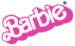
My client came to me with a vision for her brand. She was inspired by the retro Barbie logo from her childhood, and had sketched out a logo idea. Her inspiration was a great starting point for the first logo design.
 |  |  |
|---|


Logo Design
Version One
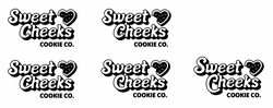
For the first logo, I recreated the client's sketch. I found a retro-inspired font and customized it to create the lettering. I created a heart icon and created several variations of the logo. I put together Canva slides to present my work, and sent the designs to the client for review.
Revisiting the Inspiration
After receiving the first version of the logo, the client communicated she wanted a more brightly colored, groovy look. We revisited inspiration of other branding she liked, and I started from scratch to create logo design version two.
 |  |  |
|---|


Logo Design
Version Two
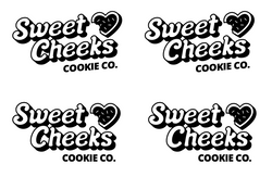
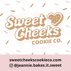
With a clarified vision, I designed logo version two. I created new custom lettering from a more "groovy" font, added a thick drop shadow, and tilted the design to mimic the retro Barbie logo. This version was more in line with the client's inspiration, so we moved forward with this direction for the brand.
Fine-tuning the
Logo Design
The logo design went through many rounds of edits before we landed on the final design. Selecting the right brand colors proved to be a particular challenge, but I was dedicated to making the client's vision come to life.
 |  |  |  |
|---|
Designing the
Print Pieces
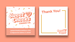
I designed three branded print pieces, a Thank You Card, Promo Card, and Freezing Instructions for her packaging. It was a fun challenge to figure out the sizing of the cards while maintaining legibility. The designs went through a few rounds of edits while the client and I finalized the branding details.
 |  |  |  |
|---|---|---|---|
 |


Compiling the
Brand Guide
After many revisions, we landed on the final logo versions, brand colors, fonts, and print designs. I refined and organized all of the designs, and compiled a online folder for easy client hand-off. As a final product, I designed a brand guide in InDesign to clearly communicate the new Sweet Cheeks branding.
The Final Product
The final branding suits the client's personality and business well. I love the bright colors and fun design! I'm happy to have completed a freelance branding project and I enjoyed creating a new, cohesive look to help grow her business.
 |  |  |  |
|---|---|---|---|
 |  |  |


